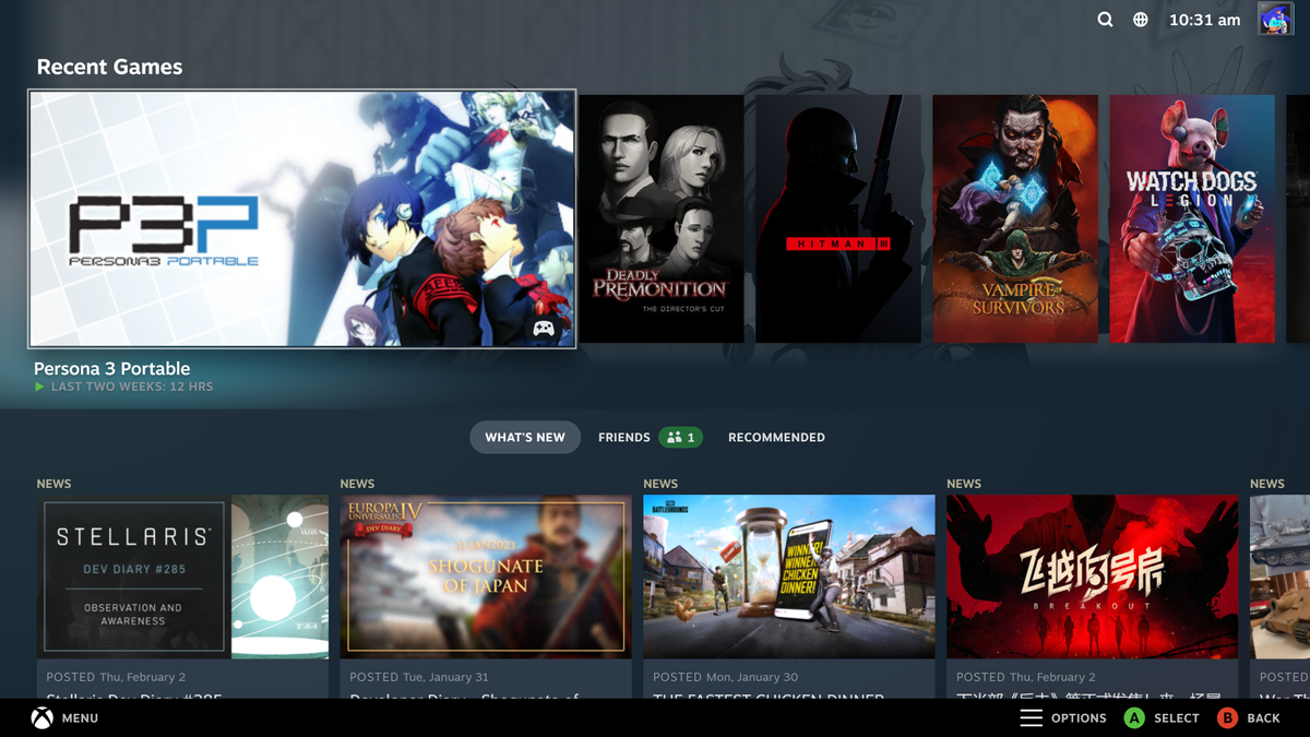
It’s been a long time coming, but Valve has finally taken Steam’s old Big Picture mode—with all its blurry visuals and tabs that straight-up don’t work—and replaced it with a new, Steam Deck-inspired UI. It came as part of a hefty Steam client update released yesterday, and in my testing seems to work pretty well, but some users are reporting a few kinks that still need to be worked out.
I’ve put some pictures of the new UI below, and it’ll be incredibly familiar to anyone who’s futzed around with a Steam Deck. It’s pretty much just the standard interface of Valve’s handheld blown up to fit the dimensions of a proper TV. The mode now drops you straight into a list of your recently-played games, rather than letting you pick between Store, Library, and Community (the first and third of which usually just crashed Steam whenever I picked them) like the old version.
Image 1 of 6
On my Xbox One controller, navigation is now performed by whacking the glowy Xbox button at the top, which brings up a list of tabs like Recent, Store, Library and so on for you to flit between. It’s a sleeker system than the old one, where similar tabs just loomed at the left-hand edge of your screen while you browsed your games. I expect it works similarly for people using non-Xbox gamepads, too.
It ran pretty much flawlessly on my machine—a mardy clunker running a 1080 Ti, 16GB RAM, and a Ryzen 3700x CPU—but user caution is advised at this point. A lot of Reddit users are reporting Steam Big Picture issues with in-home streaming, black screens, high CPU usage, broken controller inputs, and general lag in the UI. There’s still work to be done, clearly, even if the only problem I had was that a bunch of the prompts still reference the Steam Deck instead of ‘Your PC’.
You shouldn’t have to delay the update if you want to give the new Big Picture some more time in the oven, though. You can still use the old mode by running Steam with the ‘-oldbigpicture’ command-line option. Valve will be removing that option in a future update, mind you, but we’ve got that safety net for now.
Still, as someone who used old Big Picture mode pretty much every day, and who hasn’t had any problems with the new version, I have to say it’s a marked improvement. Being able to actually use the store in Big Picture mode after years of it spitting errors at me feels like a minor miracle, and the whole thing just generally feels a lot more sleek and modern. It’s shallow of me, I know, but the way the new mode jumps between screens—all accompanied by Nintendo Switch-like clicks and whistles—just feels better. It’s nice to play games on my TV and feel like I’m using software made this decade.
